AI-Assist Flight Reroute Explanation Panel
I replaced a three-tool reasoning reconstruction process with a centralized explanation panel embedded directly in the reroute approval workflow. Dispatcher confidence reached 4.4 out of 5, and 76% of reroute scenarios were completable without leaving the panel.

Timeframe
10 weeks
Users
Flight Dispatchers
Industry
Aviation
Type
Workflow Optimization
CHALLENGE
Dispatchers were reconstructing AI reroute reasoning across three tools before every approval
Domain
Flight dispatchers hold legal co-authority over every flight they release. When the AI system recommended a reroute, a dispatcher could not simply accept it. They were required, by training and by regulation, to understand why. That requirement created a structural tension: the system was designed to accelerate approvals, but the dispatcher's obligation was to evaluate, not accept.
Fragmentation
The AI surfaced reroute outcomes but not the logic behind them. Validating a recommendation required opening three separate systems: Weather Radar for turbulence data, Route Planning for waypoint feasibility, and Compliance/Ops for fuel and regulatory exposure. Each held a piece of the reasoning. None was designed to connect to the others. Dispatchers assembled the picture manually, in working memory, every time.
Burden
Stakeholders entered the project focused on time-to-approval. Dispatcher conversations revealed the real constraint: speed was not the bottleneck. Understanding was. Dispatchers were not slow because the workflow was inefficient. They were slow because the system gave them no reasoning to evaluate. Every reroute, regardless of severity, required the same full cross-system verification.
SOLUTION
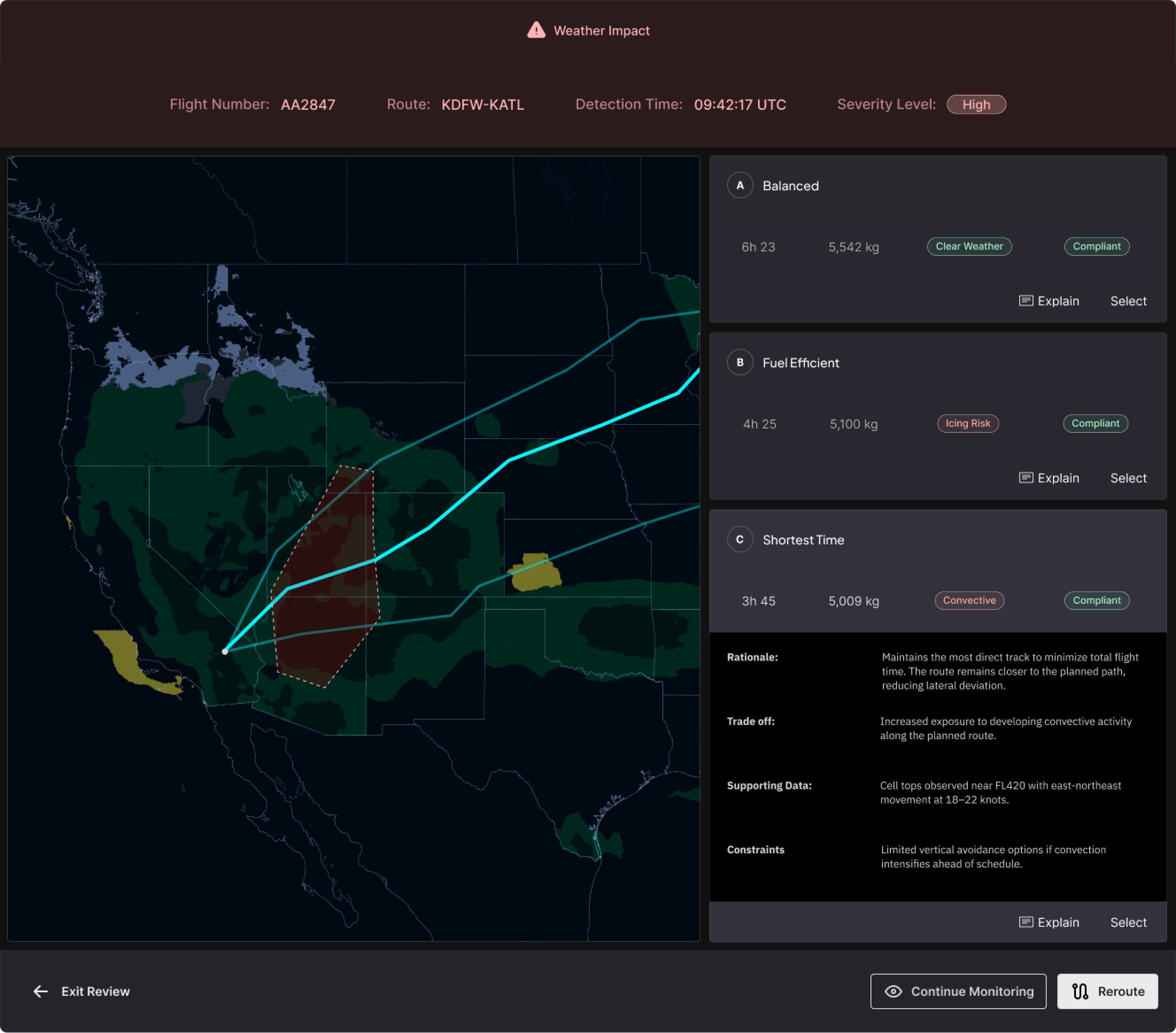
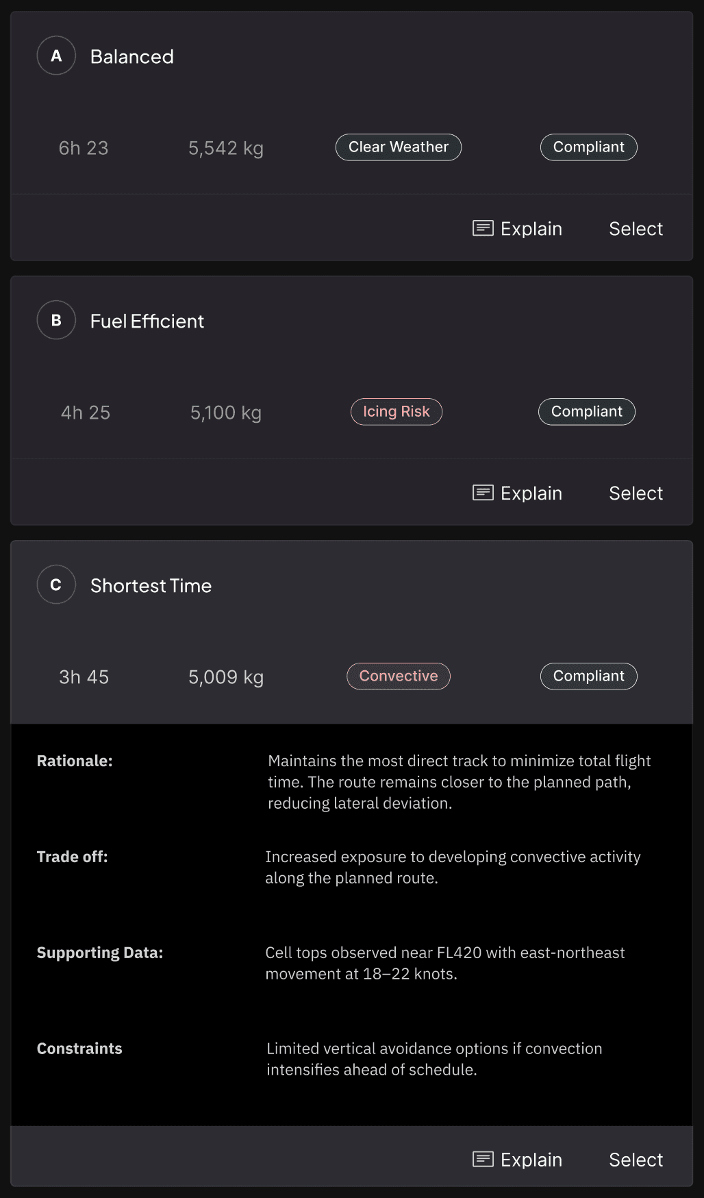
The explanation panel replaces the three-tool validation process with a single progressive interface built around three pillars:
Explainability, Cognitive Load Reduction, and Human Authority. Each pillar addressed a specific failure mode from the challenge.
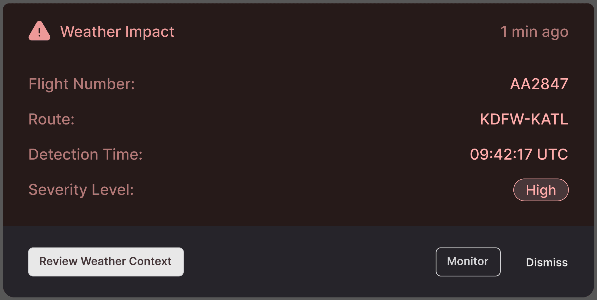
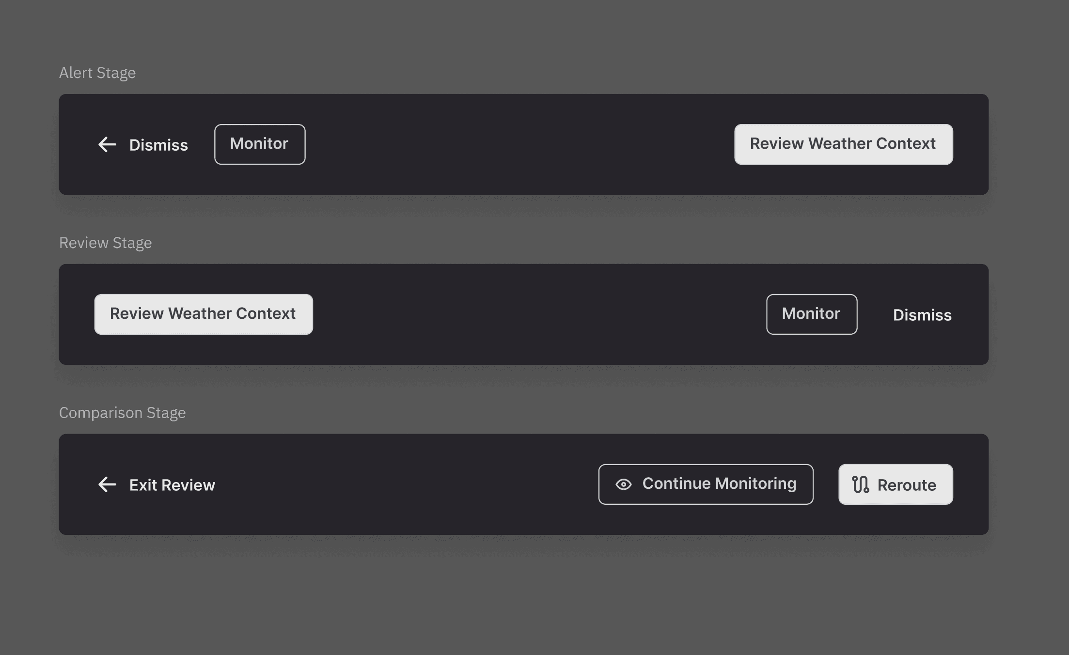
Reroute Trigger & Context
The experience begins with an alert card that surfaces the operational event driving the recommendation (weather impact, airspace restriction, or congestion) along with flight-specific context: flight number, route, detection time, and severity level. The card appears anchored to the affected flight on the map view. Dispatchers see exactly which flight is impacted and why before they take any action.
Design Rationale:
I chose to lead with the trigger rather than the route change itself. During scenario walkthroughs, dispatchers consistently asked "why is this happening?" before "what should I do?" The alert mirrors that mental model: event first, action options second.


RESULTS
I led the UX strategy and interaction design, translating complex operational data (weather, fuel, compliance, and risk factors) into clear, explainable decision support.
The design introduced structured rationale, trade-off visibility, and guided AI explanations that reduced cognitive load while preserving dispatcher authority in safety-critical decisions.
Limited explainability & trust
3 tools
1 panel
Manual cross-checking burden
automated validation
checks
APPROACH
The organizational framing was "reduce time-to-approval." The dispatcher framing was "I need to understand why before I can approve anything."
That gap, surfaced in the first round of stakeholder interviews, reframed the entire project. Speed was the wrong metric. Transparency was the design problem.
Method
Scenario walkthroughs with lead dispatchers under simulated operational conditions revealed the trigger-first mental model that shaped the alert card, the sequential reading pattern that shaped the reasoning panel, and the Monitor behavioral gap that became a core feature. The sessions were behavioral observations designed to surface how dispatchers processed operational uncertainty, not usability tests. Cross-functional interviews with the PM, Director of Ops, and Senior Developers produced the reframe and established that stakeholder alignment required a shared framework, not just a design.
ROOT CAUSE
Lack of centralized reasoning
AI recommendations surfaced outcomes but not the operational logic behind them, forcing dispatchers to interpret intent on their own.
BEHAVIORIAL EFFECT
3-tool cross-check per reroute
Dispatchers switched between Weather Radar, Route Planning, and Compliance/Ops systems.
OPERTAIONAL IMPACT
Lack of centralized reasoning
AI recommendations surfaced outcomes but not the operational logic behind them, forcing dispatchers to interpret intent on their own.
Constraints
The three-pillar Human-AI UX framework (Explainability, Cognitive Load Reduction, Human Authority) structured the design against the challenge and served as alignment scaffolding across functions. Naming the pillars shifted stakeholder conversations from "make it faster" to "make it trustworthy," which changed what scope decisions were defensible during the six-week build.
Human-AI UX framework:
01
Explainability
AI recommendations surfaced outcomes but not the operational logic behind them, forcing dispatchers to interpret intent on their own.
02
Cognitive Load Reduction
Consolidate scattered operational data into a single, scannable hierarchy — eliminating the 3-tool cross-check that fragmented the existing workflow.
03
Human authority
Position AI as presenting evidence, not directives. Dispatchers approve, reject, or investigate further — the system never auto-executes a reroute.
Collaboration
I worked alongside a Product Manager, Senior Developers, and a Director of Ops. Rapid wireframing with annotated rationale, shared with the development team before high-fidelity work began, connected every design choice explicitly to a dispatcher behavior or operational constraint. That practice kept the Monitor option on the table when engineering raised scope concerns and compressed the alignment cycles that typically slow cross-functional projects of this type.
Let's Talk
If this project raised questions, I'm available to discuss how the Human-AI UX framework functioned as a stakeholder alignment tool, the specific scenario conditions that produced the Monitor option, or how dispatcher authority was operationalized as a design constraint rather than a UX principle.
Explore More Case Studies
All
Workflow Optimization
AI

Flight Release Wizard
Redesigned flight release workflow, replacing a fragmented five-system process with a single guided workspace
